creating the rest on illustrator using rules i found through knit
very time consuming
design choice to switch black and green even tho other way would be more true to my idea but it doesnt translate
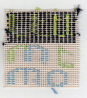
I've decided to stay with this pixel font which is based on the pixel typeface from my 50 word experimentations, but I altered the rules of how many grids are filled in (grids in this case are 2 squares as it takes that many to knit - 1 grid is 1 loop). I played with different variations to decide on which approach I would take when creating the kit and to finalise my ideas on the typeface before creating the rest of it on Illustrator as I want a majority of the decisions to be made through the rag rug process to ensure it's effective in conveying my idea and legible.
- First variation was looping the yarn alternatively with the black background which created smaller loops of green and was interesting however isn't very translatable because the green was lost within the larger black loops.
- Next was to knit the green within the same loops as the black background which allowed the loops to be bigger but it was inconsistent and risked pulling the black apart.
- Tested the previous 's' font however doesn't translate as well as looping - needs to look pixelated/gridded.
- Tested looping the 's' font - prefer the horizontal looping as it translates more as pixels however the use of just one grid wide instead of two was something I wanted to explore more as pixel fonts are usually simplified for practicality and there's no real function to having my font two grids wide.
- Continued testing out what other letters would look like and decided on the one grid wide, and keeping it symmetrical. (the 't' and o')

- Design decision to switch the black and green around so that the letters are more legible and translates more. Although it's not as accurate to binary coding as the alternative and doesn't create the same effect it still has elements enough to convey my theme and makes it easier for an accessible kit.
- tested looping on a vertical background and on a horizontal and vertical is better at allowing the yarn to be easily knit and more legible.

No comments:
Post a Comment