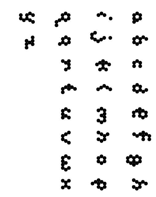
Digitalised the typeface by drawing out the circles and forming that initial shape to then recreate all the glyphs following the rule of sticking to that glyph. Digitalising allows for quicker experimentation and manipulation, allowing me to explore kerning, tracking, and scale.
The main idea I have for this typeface is to digitally alter it with Photoshop layer styles so that it can resemble liquid or chrome type as a way of creating contrast, but keeping it beautiful to represent new societies merging. This is because I don't think the typeface on its own is effective - the formation of circles creates uneven lines that don't communicate movement and the emphasis of roundness creates a font more appealing for way younger audiences, whereas I want the logotype to be eye-catching and visually pleasing to a young adult, creative target audience.
I began to try develop this typeface into a custom drawn typeface that can use the formation as a rule to link the concept but also fit in with looking professional, interesting, and appealing to the target audience.
Process of Developing Typeface:

I altered the stroke of the circles to a more angular stroke to allow for some angles that can then be traced around - consistent angles create a sense of movement and guide the reader's eyes across the page.
Tracing around the angles didn't work as although I found some of the initial shapes interesting, they didn't allow much guidance for how to approach the other glyphs, and I wasn't completely sold on what they were communicating and how this relates to the book.
I wanted the typeface to have angles, therefore tried tracing over arrows in a map that shows the movement of the refugees as a way of generating ideas on how to approach these angles. I like this lowercase "n" however this isn't a consistent enough way to approach the type development and I am aiming for something based on the floral symbol.


No comments:
Post a Comment